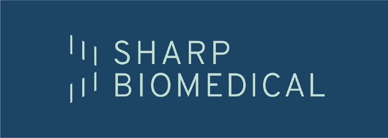
Sharp Biomedical
Part of a two person team with Hannah Schmeling working to redesign the brand identity for the spinal fusion startup, Sharp Biomedical. Our team helped to provide new brand assets including a new logo for the company, a new logo for a device that they offer, a new color scheme, a branded slide deck, mockups for applicable marketing materials, and visual elements that can be used across their brand.
PRECISE SHARP MINIMAL NIMBLE
PRECISE SHARP MINIMAL NIMBLE
Before
AFTER

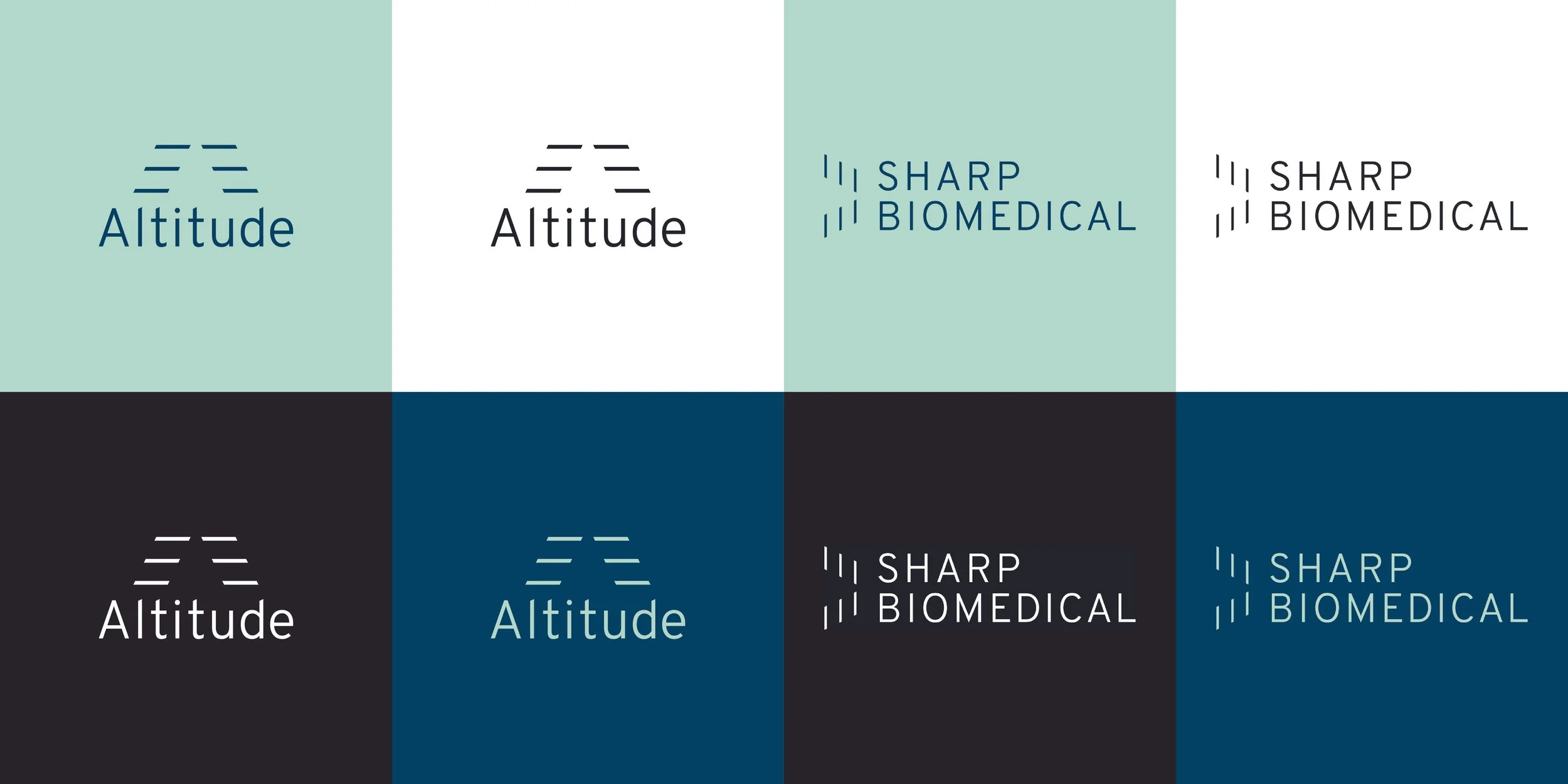
Our design team collaborated with Sharp to decide on three words that we wanted the brand to represent. To do that we decided on colors and type that we felt brought the brand into a more modern, minimal, technological space.
Precise
Nimble
Minimal

New, Relevant
marketing assets.
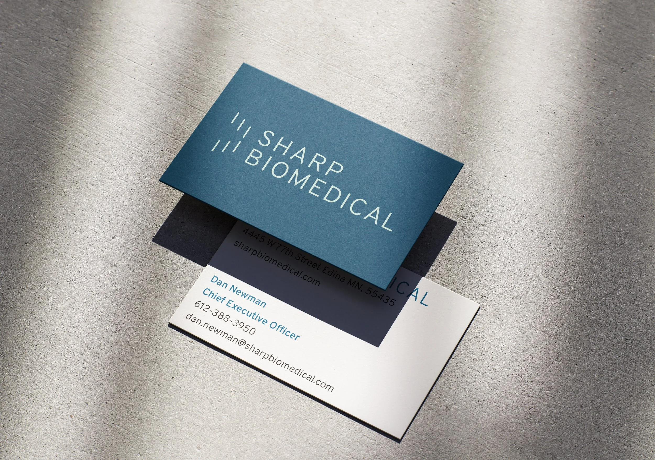
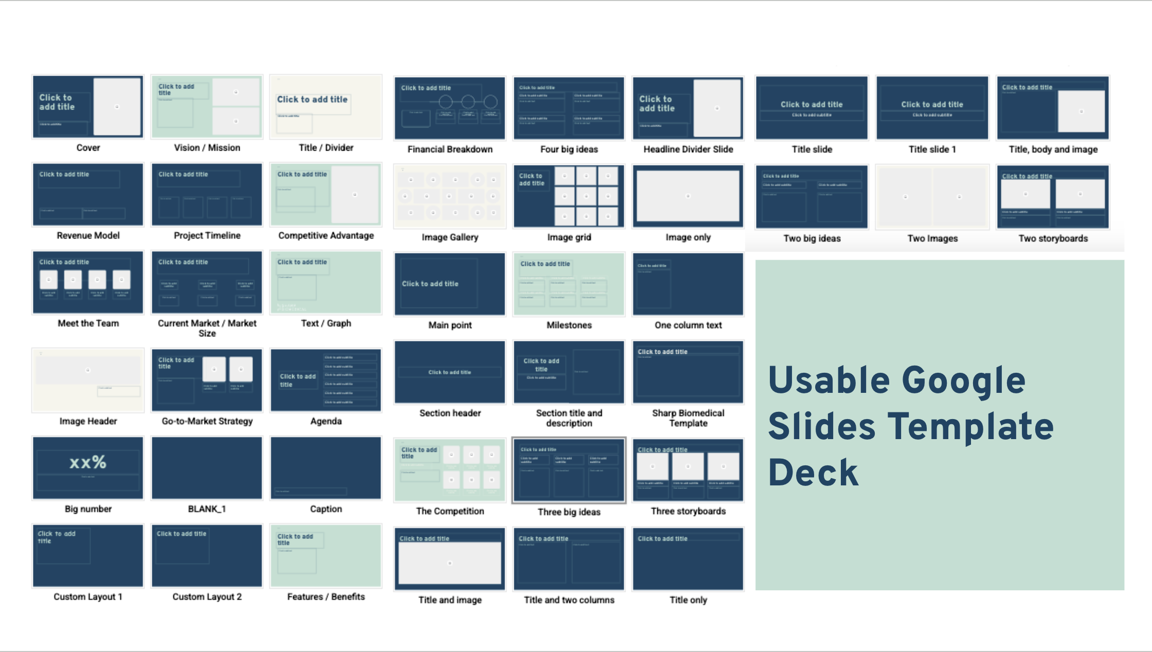
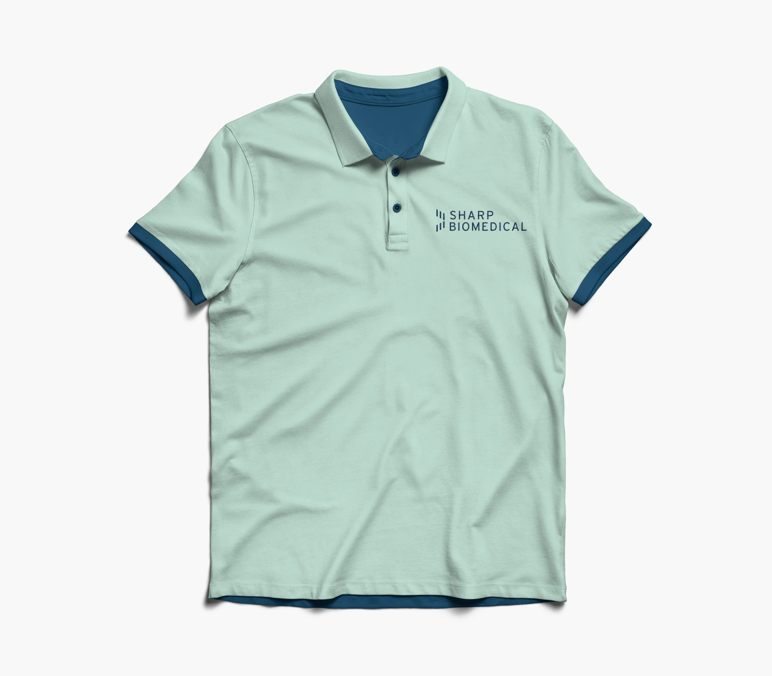
As a startup, a lot of Sharp’s marketing is done in person at trade shows or in presentations to investors. This was on our team’s mind when deciding to provide designs for a slide deck, polos, and business cards.